Sashimi
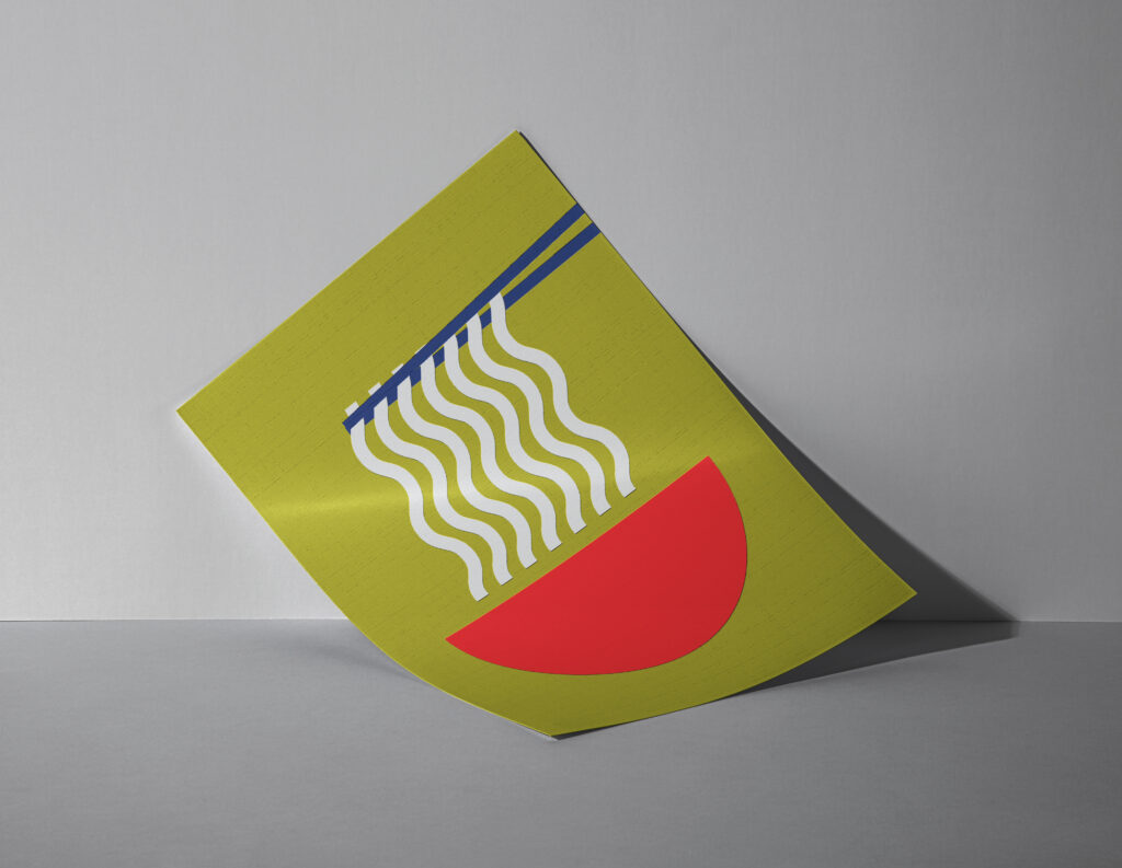
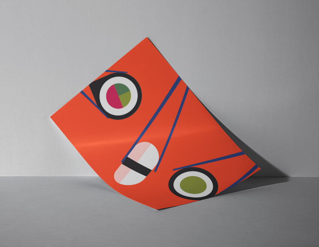
A bright and bold brand design for a new chain of sushi restaurants. Fun and fresh for a new generation of ‘foodies’
The Brief
For this project, we had the creative freedom to design a brand for a business from our own imagination. Despite my dislike for such food, I settled on a sushi restaurant named ‘Sashimi’.
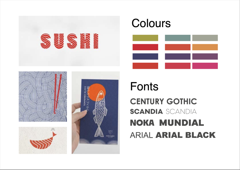
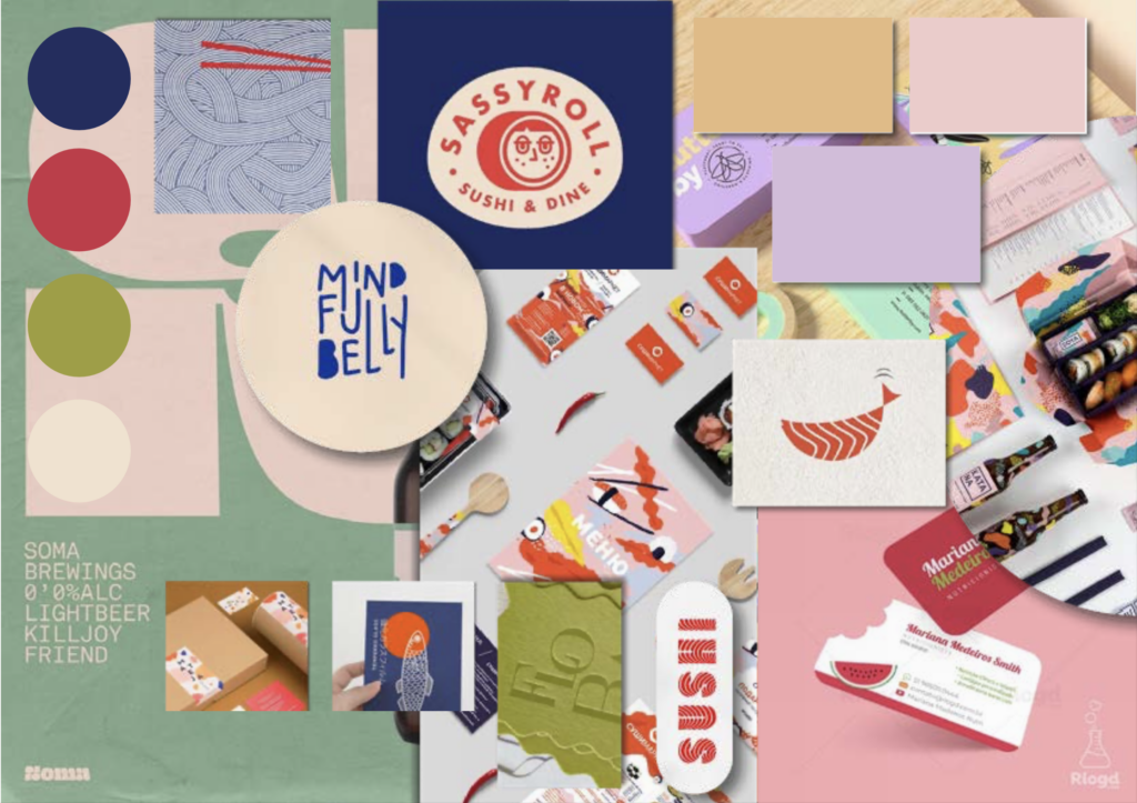
After creating my ‘faux’ business, the next steps were to research potential competitors, establish my aesthetic goals, and learn more about who my audience would be. The project became a fun challenge, as I had to create a brand for a business that, personally, I’d have little interest in, but would still be positively impacted by if I passed its advertising in the street.
Sashimi because a restaurant built for a young, hip audience that would go for the image, before the food. I could picture people visiting and taking pictures of the décor and their food and posting it to an Instagram story. In a nutshell, the brand must create a stimulating experience for its customers, that make it a talking point between friends. People should be excited to visit and fulfilled once they leave.
It was a heavily visually based project, and one of the sources I got inspiration from was the brand guide that was published in 2016 by YO! Sushi. The book was 200 pages long, broadcasting a whole redesign, orchestrated by Paul Belford Ltd, and covered everything from menus to noren curtains. I got a good idea then of the assets that I’d need to provide for my own brand, and how these would be useful for the business. I started looking into patterns inspired by Japanese culture, and current visual trends that would attract the audience I was aiming at.
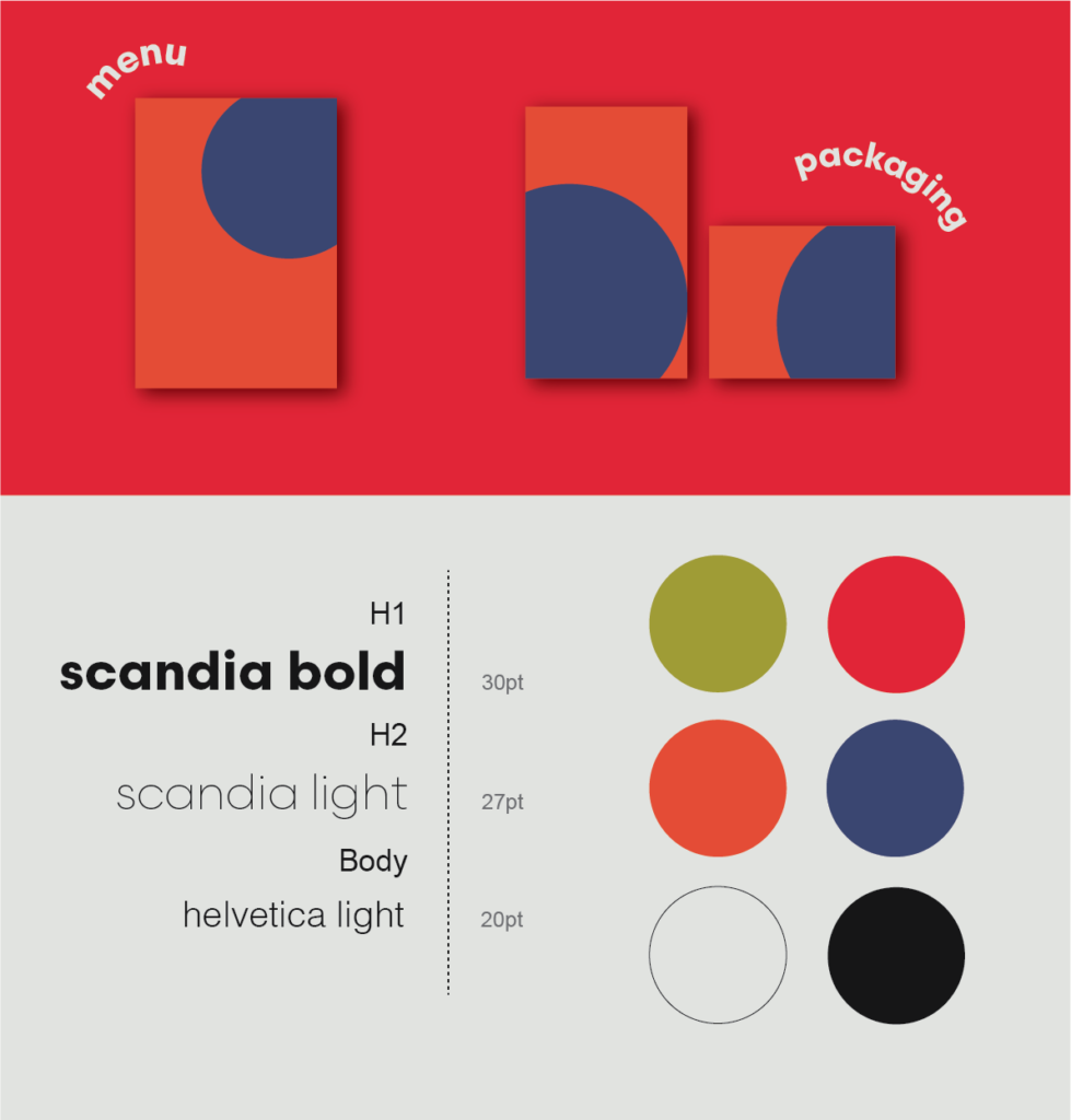
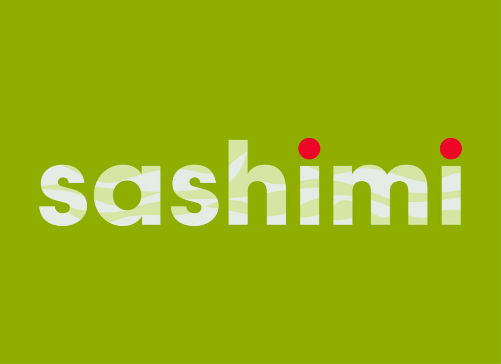
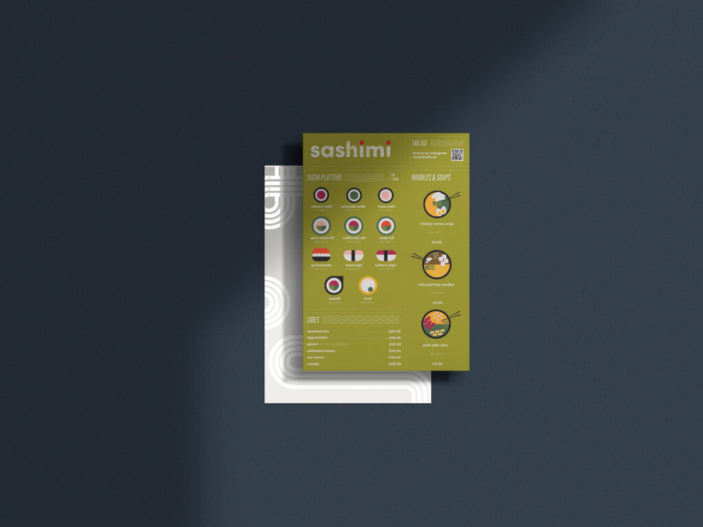
The colour scheme was minimal, sticking with about 3-4 colours, and a modern san serif font was used consistently. I predominantly used Adobe Illustrator to create a logo, packaging concepts, and posters for Sashimi, and played around with different textures to keep designs visually stimulating. I made patterns that were coherent with the Japanese influence, and inspired by the ocean, fish scales, and zen gardens.


Afterwards
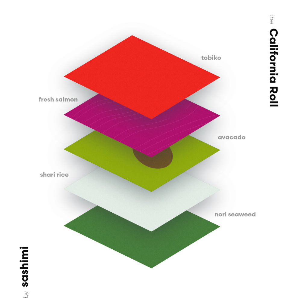
In the end, Sashimi emitted the brand I had intended for it. It was engaging, catching on the eye, and exuded confidence. I enjoyed playing around with shapes and texture to create clear assets with abstract qualities. Visibility testing was carried out on the posters and menus, and was treated as a priority throughout the project, as I wanted to maintain style and readability so that visuals were suitable for all media types.
